The Problem
The original home screen of the Enthuziastic app presented multiple usability challenges that impacted overall engagement and retention:
- Confusing Navigation: Users found it difficult to explore the app due to an inconsistent and unclear navigation structure, leading to frustration and high drop-off rates.
- Lack of Personalization: The experience was generic, offering no tailored content to match individual interests or activity history.
- Outdated Visuals: The interface felt dull and disconnected from the brand’s energetic and community-driven identity, failing to leave a strong first impression.
These issues highlighted the need for a more intuitive, personalized, and visually engaging home screen to better serve user needs and reflect the brand’s spirit.
My Goal Was
The primary goal of the home screen redesign was to enhance user experience and boost engagement by addressing key usability issues. My aim was to create a welcoming, intuitive, and visually appealing entry point that keeps users engaged from the moment they open the app.
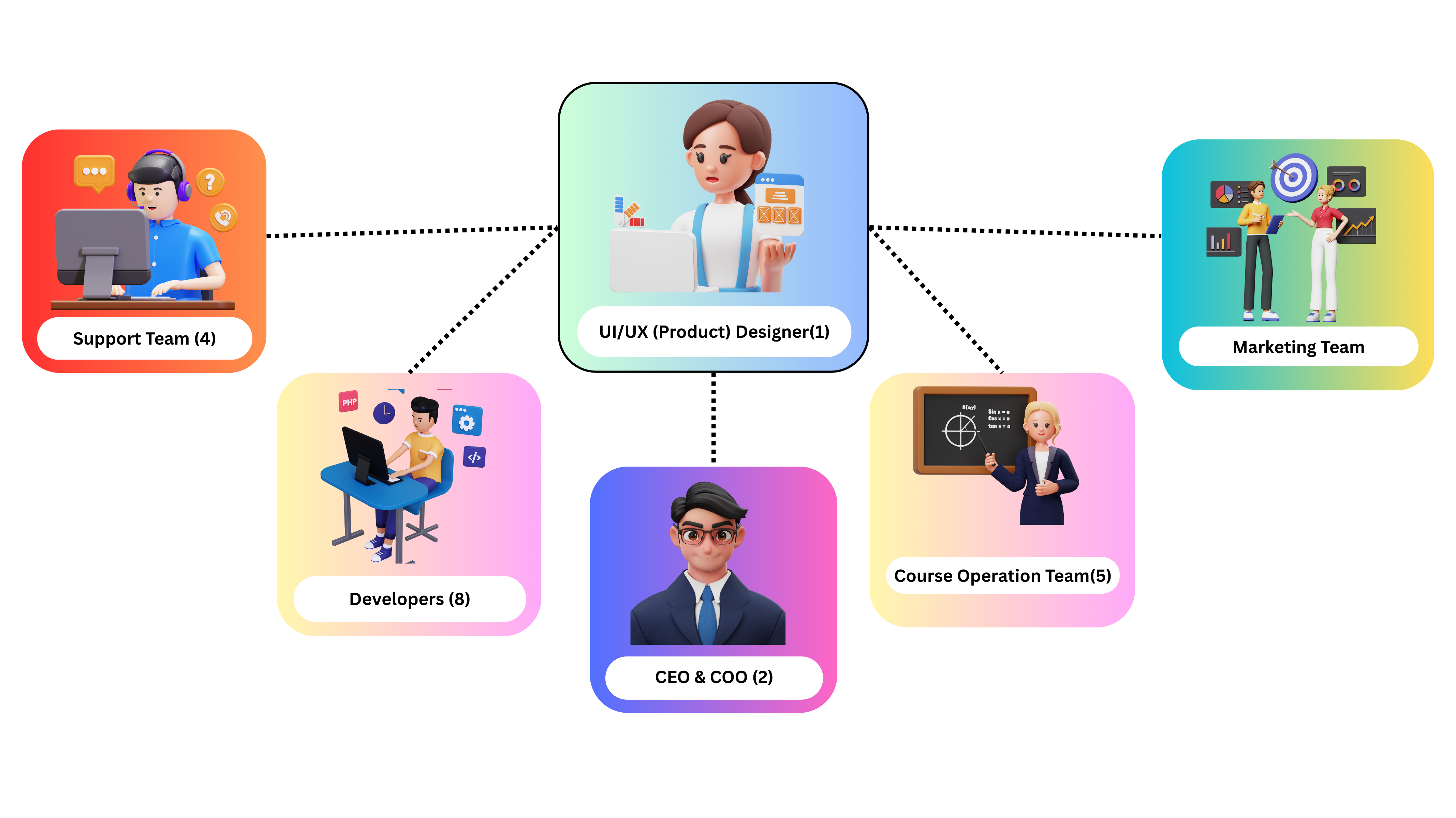
The Team
I led the design solo, collaborating closely with CEO, Developers, Marketing team, Course operation team, and Support team. It was a tight, agile setup that enabled quick iterations and seamless execution.
The Process
As the sole designer on this project, I led the complete redesign of the Enthuziastic app’s home screen from research to final delivery. I worked closely with the CEO and collaborated with the operations, marketing, and support teams to gather feedback and align the design with business and user needs. Their input played a crucial role in shaping each stage of the design.
Key Steps
1. Requirement Gathering:
- I collaborated with the CEO and internal teams to understand business goals and user pain points. Collected insights from operations, marketing, and support teams to define redesign needs.
2. User Research:
- I analyzed app usage behavior and internal feedback to identify usability issues, including confusing navigation, lack of personalization, and outdated design.
3. Defining UX Goals (Set Clear Objective):
- Improve navigation for a smoother and more intuitive user experience
- Introduce personalized content to increase relevance and engagement
- Refresh visual design to reflect the brand’s energetic and inclusive identity
- Ensure a clean and accessible layout across devices
- Create a welcoming first impression that encourages exploration and retention
4. Design & Iteration:
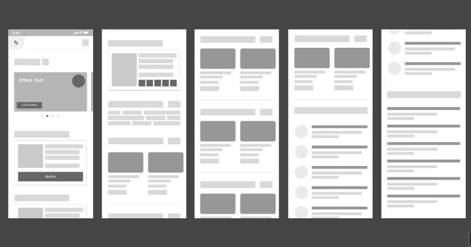
- Sketched wireframes to explore layout and content hierarchy
- Designed a visually engaging and user-centric interface in Figma
- Built interactive prototypes to validate user flows
- Continuously improved the design based on feedback from the CEO and internal teams
5. Handoff & Implementation Support:
- Prepared developer-ready design files and provided support during the implementation phase to ensure accuracy and consistency.
Wireframes
Key Features Introduced
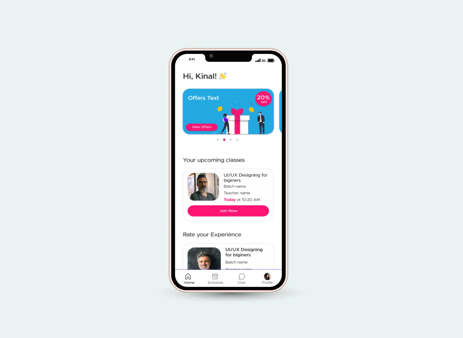
1. Personalized Recommendations:
The redesigned home screen offers personalized course and content recommendations based on user interests and activity history, increasing relevance and engagement.
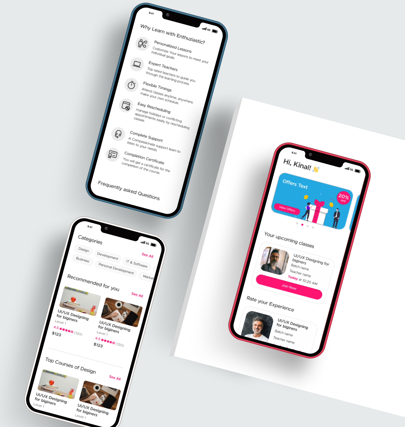
2. Clean & Modern Visual Design:
Introduced a refreshed visual style with a clean layout, brand-aligned color scheme, and modern typography to create a welcoming and professional first impression.
3. Easy Navigation:
Simplified the navigation structure to allow users to quickly find courses, tutors, and categories with minimal clicks.
4. Promotional Banners:
Added prominent banners to showcase ongoing promotions, offers, and featured courses to drive conversions.
5. Quick Access Shortcuts:
Included shortcuts to frequently used features, such as booked classes, favorite tutors, and upcoming sessions, improving user efficiency.
Final Design Snapshot
User-focused home screen that aligns with Enthuziastic’s brand identity. It delivers a seamless experience with personalized content, clear navigation, and engaging visuals making it easier for users to discover and connect with what they love.